Arabic for Little People
Brand Identity & Logo Design
Client: Arabic for Little People
Position: Freelance Graphic Designer & Motion Graphics Maestro (Remote)
Agency: SI DESIGN Solutions
Role: Brand Identity, Logo Design, Visual Strategy
PROJECT OVERVIEW"Arabic for Little People" is an engaging educational platform designed to make learning the Arabic language
fun, approachable, and intuitive for young children. SI DESIGN was commissioned to craft a cohesive brand
identity that instantly communicates the core purpose of the brand to parents and kids alike.
THE CHALLENGE
The key objective was to create a bilingual logo concept that seamlessly bridges English and Arabic elements.
The mark needed to feel playful and friendly for kids while maintaining a clean, professional aesthetic suitable
for cross-platform digital and print applications.
DESIGN SOLUTION & CONCEPT
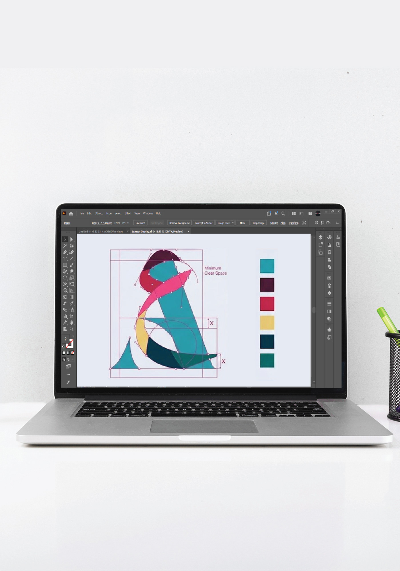
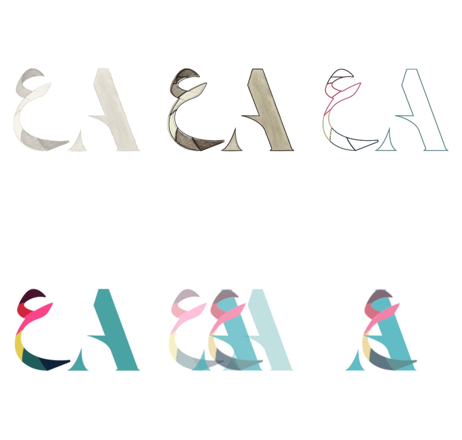
Bilingual Integration: The central symbol cleverly integrates the Latin letter "A" with flowing, stylized Arabic
letterforms (such as Alif / Ayn), establishing an immediate visual link between English and Arabic learning.
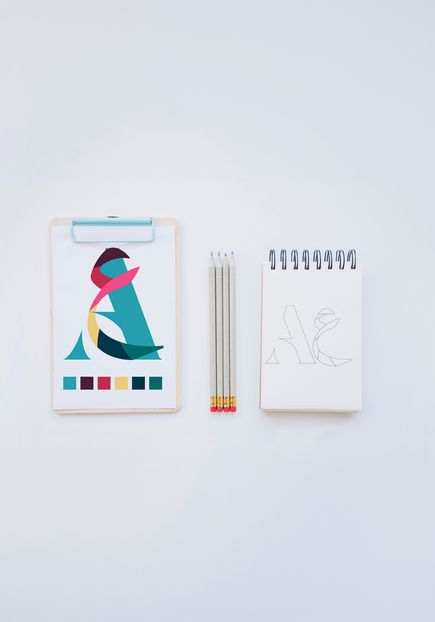
Color Psychology: A grounding teal/green foundation forms the structure of the letter "A", representing
growth and stability. Vibrant overlay shades—magenta, warm yellow, and deep plum—add playful energy to
attract young learners.
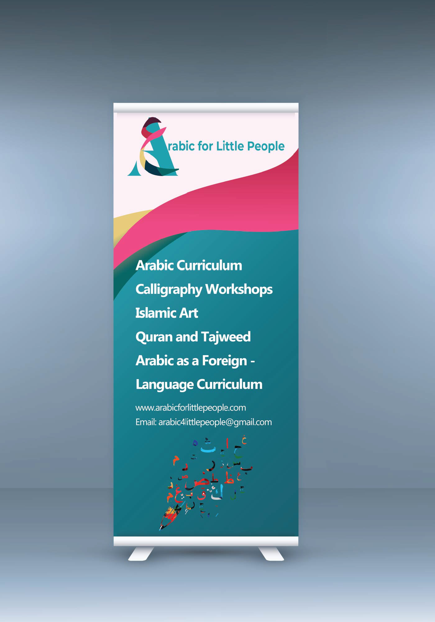
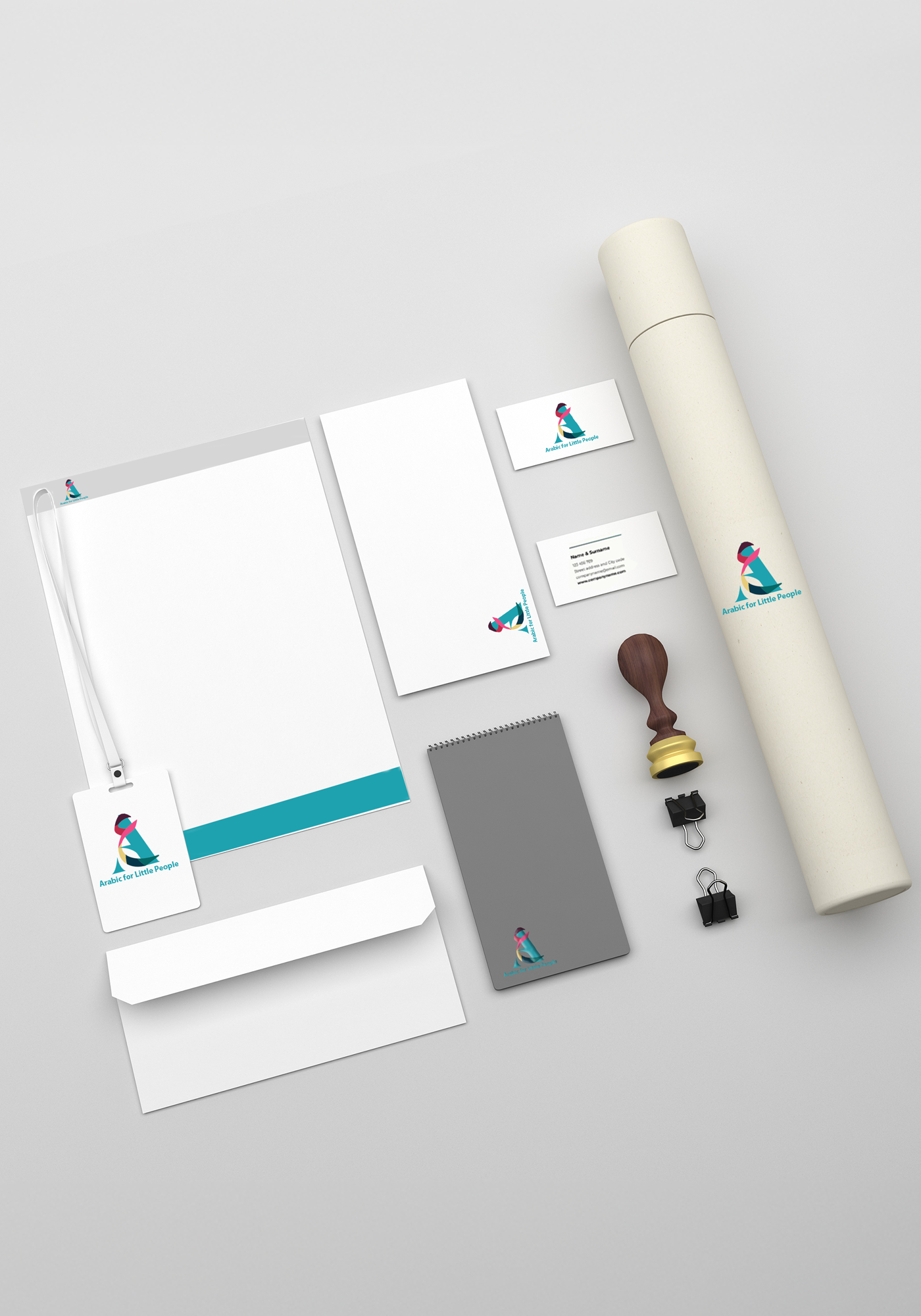
Versatility: Designed with visual balance and adaptability in mind, the emblem functions effortlessly across
responsive web layouts, printed educational assets, stationery, and promotional materials.
DELIVERABLES INCLUDED
• Primary Brand Identity & Logo Suite
• Color Palette & Visual System
• Digital & Print Application Mockups
Crafted with precision by SI DESIGN Solutions